
Color spaces and color profiles are two concepts that are often confused with one another, yet they are Fundamental to Understanding Color Management in Photography.
If you want your images to look consistent across different devices — camera, monitor, printer, or web — you need to clearly understand how colors are defined, interpreted, and translated. This is not a secondary topic: Color Management directly affects the quality and reliability of your Photographic Work.
In this Color Management Guide, we’ll clarify:
The difference between color models, color spaces, and color profiles
Why they matter in a photographic workflow
The most common color spaces used in photography today
The Basics: Color Models
At the foundation of everything are color models.
The most well-known are:
RGB (Red, Green, Blue) – used by cameras, screens, and digital devices
CMYK (Cyan, Magenta, Yellow, Black) – used in printing
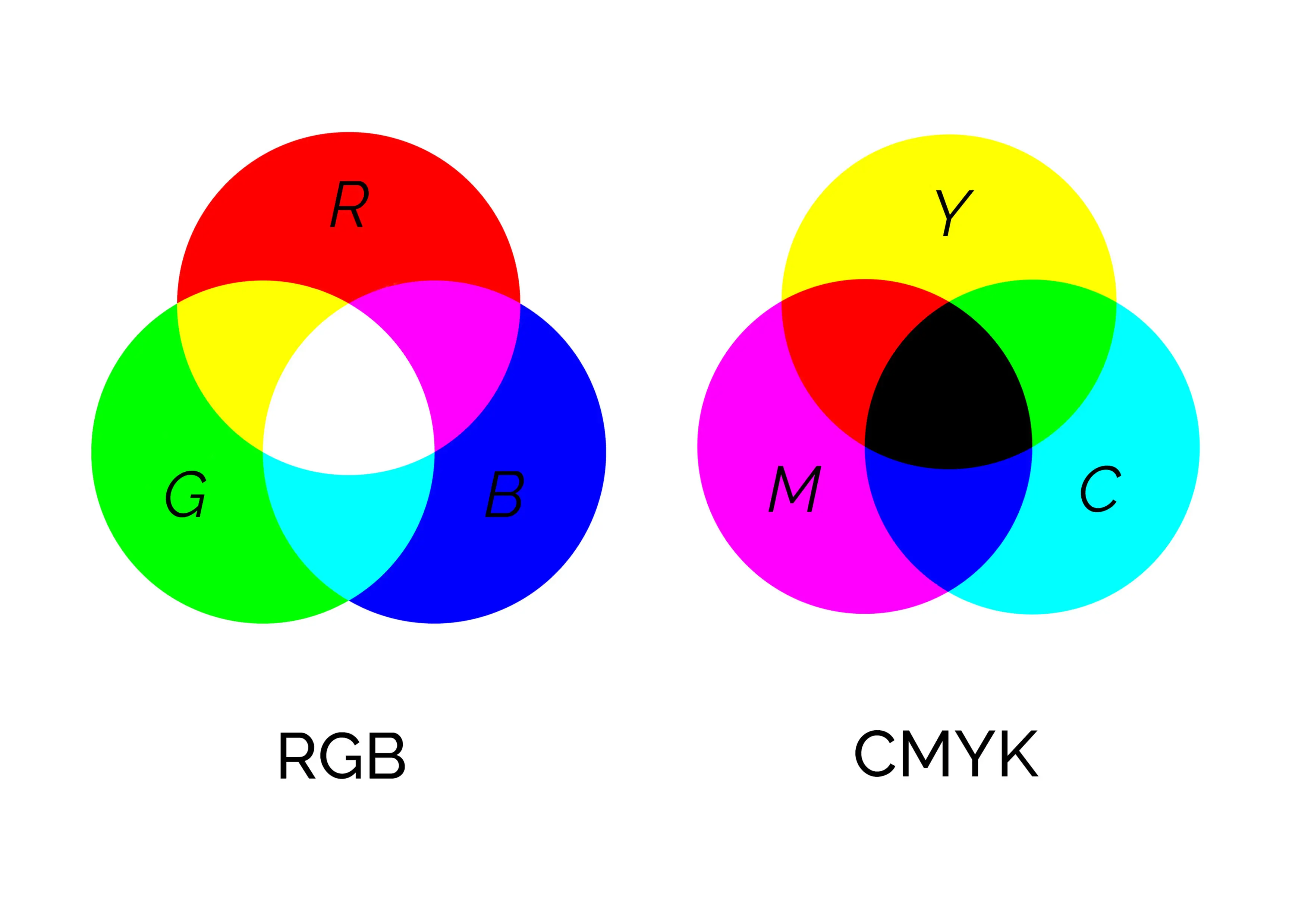
A color model is an abstract mathematical system that describes how colors can be represented using numerical values. On their own, color models do not define which colors can be displayed or printed — they only define how colors are described.
This is where color spaces come into play.
What Is a Color Space?
A color space is a specific implementation of a color model.
It defines a precise range of colors (gamut) that can be reproduced.
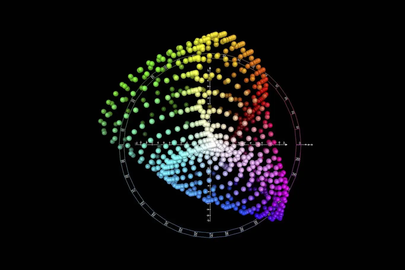
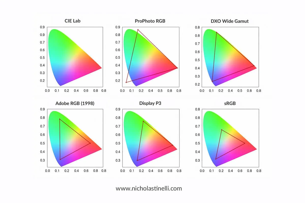
In photography and color management, the reference is usually the CIE L*a*b* color space. This is a three-dimensional, device-independent color space designed to represent all colors visible to the human eye.
Most practical color spaces (especially RGB-based ones) cover only a portion of the CIE LAB space.
Color Spaces in Photography
In photography, choosing the right color space is a crucial step that directly influences how colors are captured, edited, displayed, and printed.
Each color space defines a specific gamut, meaning the range of colors that can be represented within a digital file. Some color spaces are intentionally limited to ensure maximum compatibility across devices, while others are much wider and designed to preserve as much color information as possible during post-production.
There is no single “best” color space for every situation. The ideal choice depends on the final use of the image, the devices involved in the workflow, and the level of control required during editing. For example, an image intended for social media will benefit from a different color space than one prepared for fine art printing or professional publication.
Below are the most commonly used color spaces in photography, ordered roughly from smallest to largest gamut. This progression helps illustrate how each color space expands the range of reproducible colors, and why wider gamuts offer greater flexibility during editing — while also requiring more careful color management.
sRGB
The smallest and most widely used color space
Standard for the web, social media, and most consumer devices
Designed to match the capabilities of early monitors
Pros: maximum compatibility
Cons: limited color range, especially in greens and cyans
sRGB is ideal for online use but restrictive for advanced editing.
Adobe RGB (1998)
Larger gamut than sRGB, especially in greens
Widely used in photography and professional printing
Pros: better suited for print workflows
Cons: not ideal for web unless properly converted
Adobe RGB strikes a balance between gamut size and practical usability.
Display P3
Developed by Apple and widely used on modern smartphones, tablets, and displays
Larger gamut than sRGB, especially in reds and yellows
Pros: better color richness for modern screens
Cons: still not universally supported outside Apple ecosystems
Increasingly relevant for photographers working primarily for digital display.
ProPhoto RGB
Extremely large gamut, larger than what most devices can display
Encompasses almost all colors captured by modern digital cameras
Pros: maximum color information for editing
Cons: dangerous if used incorrectly (banding, posterization in 8-bit files)
ProPhoto RGB should always be used in 16-bit workflows and mainly during post-production.
DxO Wide Gamut
A modern, very large color space developed by DxO
Designed to preserve camera sensor color information without clipping
Pros: optimized for RAW processing
Cons: limited compatibility outside DxO software
It is conceptually similar to ProPhoto RGB but tailored for RAW development.
CIE L*a*b*
Device-independent reference color space
Represents the full range of human vision
LAB is not a working color space in the traditional sense, but a reference system used for color conversion and comparison.
What Is a Color Profile?
While a color space defines which colors are possible, a color profile defines how a specific device reproduces those colors.
Every device interprets color slightly differently:
Two monitors of the same brand and model can display different colors
Printers and papers behave differently
Cameras record color uniquely based on sensor and processing
This is why color management exists.
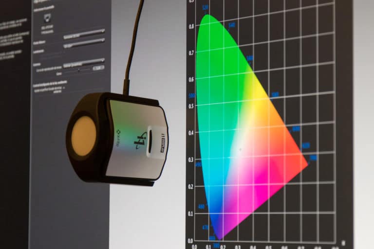
ICC Color Profiles Explained
A color profile (ICC profile) is created through calibration using a:
Colorimeter
Spectrophotometer
The profile acts as the colorimetric identity card of a device.
It maps the device’s RGB (or CMYK) values to the reference CIE LAB color space, describing exactly how that device reproduces color.
In practical terms, a color profile allows software to:
Translate colors correctly between devices
Maintain visual consistency across the workflow
If you want to learn how ICC profiles are created, you can refer to my dedicated article on the topic.
Color Spaces vs Color Profiles: The Key Difference
To summarize:
Color space: defines the range of colors available
Color profile: defines how a specific device reproduces those colors
You always work inside a color space, but accuracy is only possible when correct color profiles are applied.
Color Management: Why This Matters for Photographers
Understanding color spaces and color profiles helps you:
Avoid unexpected color shifts
Choose the right color space for each output
Preserve color information during editing
Achieve consistent results across devices and prints
Color management is a complex topic and often misunderstood, but mastering it is a huge step toward professional-level photography.
Color Management Guide: Final Thoughts
I hope this article has clarified the difference between color spaces and color profiles, and why both are essential in photography.
It’s not an easy subject, but once understood, it will dramatically improve the reliability and quality of your images.
If you enjoyed this article or have questions about color management, feel free to write in the comments below — I’ll be happy to help.