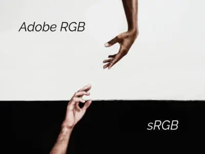
Did you bring your photos to print in the laboratory and the result is very different from what you expected?
It happened to me too to find myself in this situation when I started to take my first steps in digital photography. Everything revolves around proper color management. Understanding how to manage color is essential to achieve good results in post-production and printing. To work with maximum precision the devices we use should be correctly calibrated and profiled: they must be able to “communicate in the same language”.
The objective is to try to maintain the properties of an image, starting from the shot, to the display on a screen and finally in print.
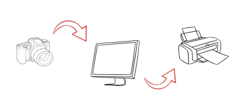
We know that comparing the same image on different devices (monitors, scanners, printers, mobile phones, etc..) we will see in each the colors differently: more saturated, darker or, for example, with a strong green dominant. Even two monitors of the same brand and model are different from each other and do not have the same factory color profile.
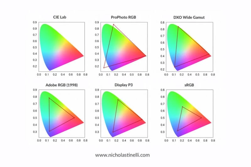
In order to solve this problem and to make it possible to work with criteria and organization in the world of graphics, a CMS (color management system) was invented. It uses a common language based on the three-dimensional CIE L*a*b model (developed to describe the colors that the human eye can perceive).
Through the calibration of a device an ICC color profile is generated, a sort of colorimetric identity card of the device, which is the result of the association of the coordinates of the L*a*b color model with each RGB value (Red, Green, Blue) of a color space.
What do you need to calibrate and create ICC profiles on different devices?
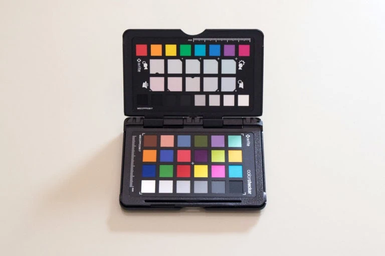
1. For cameras and scanners (input devices) you will need a ColorChecker. The use of this tool is important in order to obtain precisely, in the post-production phase, the same colors that were present in the original scene. Useful mostly in fashion or product photography, where it is essential that the colors are recorded with the highest accuracy.
2. For screens (display devices) you will need a colorimeter or a spectrophotometer. On the market, the most reliable brands are X-Rite and Data Color.
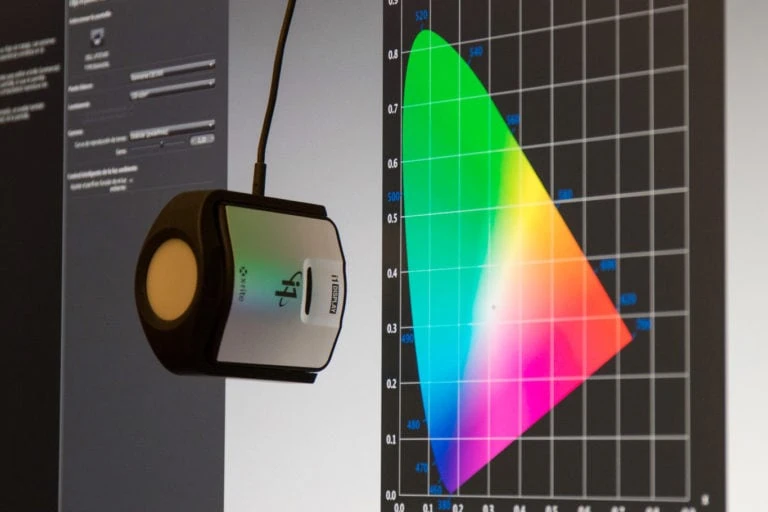
3. For printers (output devices), you will need a spectrophotometer.
Better the colorimeter or the spectrophotometer?
Although the colorimeter is ideal for calibrating monitors and projectors, the spectrophotometer can also measure the color printed on a physical medium. The most advanced models could be a good solution for calibrating all peripherals with a single instrument.
Preview of the photo in print: the color proof.
If you don’t have the possibility to print at home and generate an ICC profile of your printer with a spectrophotometer, you should be looking for a serious and professional laboratory that will give you the profile of the printer they use, such as Kinefot (Talcahuano 244, Buenos Aires), which gives you the possibility to download it from their site.
The profile is generated for each printer and the type of paper. Once you get it, you can upload it to Photoshop in View —> Proof Setup —> Custom. Under “View”, in the same drop-down menu, you can then activate the “Proof Colors” with the profile loaded (as shown in the images below).


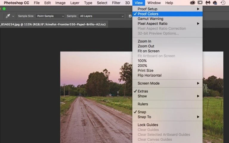
You will get a fairly accurate preview of the result in print and you will avoid meeting with nasty surprises when you’re picking up your photos from the lab!
I hope these basics will help you improve your workflow and get better results, especially when printing. Fully understanding these aspects requires dedication and time.
If you liked the article or have any questions about it write me a comment below or we can arrange for a private lesson via Skype.

